version 0.7
this still is a "buggy" version of the styleHowTo. i know it is full of mistakes of any kind. if you find any of them please do me and all other users the favour and contact me either via email: tenner(at)fluxbox(dot)org or meet me (tenner) in #fluxbox or #fluxmod on irc.freenode.net to give me a hint of what i did wrong. if anyone wants to tell me what is not clearly explained, please let me know the same way, i'm gonna say thank you, that's for sure ;)
i bow to all people who helped me deleting mistakes and told me additional information. extra thanks to lmg aka M.G. Kishalmi, who reported a bunch of mistakes and had great ideas for additional informations and hints.
HowTo style fluxbox
0.
1.
some rules to know (please read this first, maybe your problem is solved after that)
this are some basics you should follow:
- you can do a style with a simple textfile (i call this a "classic-style"). this will be compatible with almost every version of fluxbox.
- you can also do style with a simple textfile and images (xpm/jpg/png), but remember this: almost every user of fluxbox will use a version being able to handle pixmaps .. BUT .. only some have fluxbox compiled with IMLIB2-support (they need this to render other image formats other than xpm). due to the fact that it's not enabled by default yet and probably never will be, i recommend using pixmaps. there seems to be no advantage of using jpg/png-files, at least in a style.
- another thing to know is how to save such a style. if you've made a "classic style", the name the file can be every name you like as long as you directly put it into any directory the menu-file s is pointing to as a "styles dir".
the second way is to put the file into its own directory that will be afterwards put into the "styles dir" the menu-file is pointing to. the filename then MUST be: theme.cfg (it's case-sensitive, so take care of that).
a style using images is almost like the second way described for the "classic style" above. the structure of the directory has to look like this:
name_of_the_style/
	|
	|____ theme.cfg
	|
	|____ preview.jpg (additional)
	|
	|____ pixmaps/
		|
		|____ * (all image files)
the rules are the same as for "classic styles" (remember the case sensitivity?)
i recommend the way of putting the style file into a separate directory in any case to keep it more uniform.
- do not assume all users have the same settings as you do. most people use the default order of the window buttons and such, but sometimes users change it. the same with the toolbar buttons. even if mouseWheeling is a great feature, some still have the buttons enabled. so make sure you deliver a "complete" style with textures/images for all parts.
- this is additional, but a lot of people will be grateful if you follow this rule. put a screenshot image of your style that must be called preview.jpg into the style's directory. out there is an application called "fluxStyle" written by errr that can be found on the official site. this little program will use preview.jpg to display a preview of the style and then lets you apply it. the image should have size of something like 320x120. it can be smaller or bigger but please not as big as the users screen, because it will fill out the entire monitor then. this will help having a look at the style before using it.
- to set colors you have three ways:
the first one is to call a HEX-value like #000000 or #ffffff.
the second way is to use the rgb-color notation. so the color would be rgb:38/4/4 or rgb:00/64/00. (look into 'man x' for more information)
the third way is to call the colors by their names. look into /etc/X11/rgb.txt or /usr/X11R6/lib/X11/rgb.txt to get the color-name.
for me (and for the most people i know) the use of HEX-colors is the easiest way.
some apps that i use and recommend are: gcolor (gtk1), gcolor2 (gtk2), xcolorsel (this should be in any distro's repo's, except for the slackware vanilla install), kcolorchooser (part of kde) and of course gimp .
- you can mix elements of of pixmap and classic styles. make the images for the windowdecorations and the toolbar and make the menu the classic way or do a pixmap style and only use the classic bullet and so on.
- it was possible to use the "root-command" which was exchanged for the the backround option. you don't know what that is? good .. forget about it! if you know what it is .. please do not use it. if you really made a matching wallpaper, put it into the style file, but don't force the user to use your background, is's a matter of personal choice. it's just a mean thing and also very annoying to a lot of people.
- round aterm/xterm/term/applications/window/menu/toolbar/whatever please go to this section.
2.
the main parts
this are the main components a fluxbox style consists of:
- root menu (style will be adapted by the workspace-, toolbar-, window- and the iconbarmenu)
- toolbar (including the workspacelabel, the iconbar, the systemtray, the clock and the buttons for switching to the next workspace/window)

- windowdecoration (namely the titlebar, the buttons (close, maximize, etc), the grips and the handle)

- fonts
3.
fonts
most people ask about the font-handling, so i will start with it first.
one useful thing to know is that you can include fontsettings. that does mean you can put your whole *.font settings in a seperate file and and point to it in the style file. imagine you have some fonts you prefer and don't want to change every style you have downloaded. then you can simply make a file e.g. "~/.fluxbox/myfonts" and write the normal fonts-stuff (as you would write it in the style-file) in this local file. then put the following line in the style:
# include "~/.fluxbox/myfonts"
don't forget the "#". due to fluxbox will use the last entry in a style file, if something is double, just make sure it's the last one (echo "foo" >> ~/.fluxbox/styles/bar/theme.cfg). that lets you always use your local style-fonts. this has nothing to do with the making of a style but it's good to know :)
.but back to the fonts in a style ..
.. there are seven elements you can define a font for:
menu-title (the title of all menus you use)
menu.title.font: <fontname>
frame (the entries that are in every menu)
menu.frame.font: <fontname>
window (the font of the title of every window)
clock (yeah, it's the fluxbox clock)
toolbar.clock.font: <fontname>
workspace (the font of the workspace labels aka name)
toolbar.workspace.font: <fontname>
iconbar (the label of the application the iconbar is holding)
(as you can see, different from the window, you can set fonts for two iconbar-states namely focused/unfocused)
toolbar.iconbar.focused.font: <fontname>
toolbar.iconbar.unfocused.font: <fontname>
4. fontnames
if using xft-fonts (so called ttf-fonts) you use them like this: "<fontname>-size". you can set them bold by adding ":bold". this gets easier with an example. the next line will give you the tahoma font in bold, with a size of 12.
if using x-fonts please run 'xfontsel' to find out what the right names are. for example:
-misc-*-*-*-*-*-*-200-*-*-*-*-*-*
furthermore you can make fluxbox try to load several fonts
that will cause fluxbox to load (if compiled with xft) arial-10, otherwise, if the loading failes, it will load a different xft-font. while a fluxbox not compiled with xft support will try to load the artwiz-font. if everything fails all will fall back to "fixed". so in the end it will always load a font even though it is not the one you have set in the style.
5.
font effects
if using xft-fonts you can set up two nifty effects on the fonts.
shadow
*.font.effect: shadow
*.font.shadow.color: <color>
*.font.shadow.x: <int>
*.font.shadow.y: <int>
halo
*.font.effect: halo
*.font.halo.color: <color>
you can set one effect either a shadow or a halo. if set once there is no need to set a color for those items, but you can. look at the example below to get an impression of what i mean:
menu.title.font: sans-8:bold
menu.title.font.effect: shadow
menu.title.font.shadow.color: #ffffff
menu.title.font.shadow.x: 2
menu.title.font.shadow.y: 5

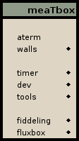
as you can see the title (meaTbox) has a black shadow with a horizontal offset of 2 and a vertical offset of 5. the values can be negativ too. positive values will be right for x, down for y. negative values will be the opposite (left and up).
6.
styleparts
the way to style the parts of fluxbox is basicly always the same. every part consists of similar components (sometimes the same components) that will repeat within the other parts. that sounds very weired and if you know a better sentence to explain it please let me know, but let me make this clear with an example:
the menu can have a border and a bevel. this border around the menu can have a color and a width. the window can have the same items as the menu. it can have a border, a border-color, the border around the window can have an own width and color and so forth.
this was only to show that the way to make a style is almost the same for all components of fluxbox. this situation gives you a simple way to "style all in one", but more of that later in the next chapter (generalizing (wildcards)). let's start with a "classic style".
to give you an overview of all options avaliable we start with the menu
if you can't remember what the texture options are or don't even know what they look like, check the texture-examples page.
menu.bevelWidth: <int>
menu.borderWidth: <int>
menu.borderColor: <color>
menu.bullet: <empty|triangle|square|diamond>
menu.bullet.position: <left|right>
menu.itemHeight: <int>
menu.title: <texture>
menu.title.justify: <left|center|right>
menu.title.color: <color>
menu.title.colorTo: <color>
menu.title.textColor: <color>
menu.titleHeight: <int>
menu.frame: <texture>
menu.frame.justify: <left|center|right>
menu.frame.color: <color>
menu.frame.colorTo: <color>
menu.frame.textColor: <color>
menu.frame.disableColor: <color>
menu.hilite: <texture>
menu.hilite.color: <color>
menu.hilite.colorTo: <color>
menu.hilite.textColor: <color>
the explanation is really easy.
*.width sets the width in pixel for the border and the bevel.
*.borderColor does what it says.
menu.bullet defines the bullet (little thing in the root-menu that indicates a submenu). the bullet addapts the color of the frame-text that is set with menu.frame.textColor and the hilite-color from menu.hilite.textColor. i won't say anything about menu.bullet.position. the bullet-types are self-explanary, don't tell me anything else.
menu.frame.disableColor is the color of the menuselections of the layer-menu, the placement-menu, the iconbar-mode-menu and such.
the selection indicator gets its normal color AND the texture from the menu.hilite settings. the color AND texture in hilited state is the same as of the menu.frame settings.
menu.itemHeight sets the padding of each line in the menu, so you can increase the height of each line of the menu. that will put more space between the entries if the font is too small. this has NO effect on the title! just try it out if you think the menu looks too wedged and keep in mind that you cannot make it smaller than the height needed to display the font correctly. you have to try different values or even change to a smaller font. there are no general settings for that. but be aware of this: if you have icons in your menu, then you will stretch them too.
menu.titleHeight is the same as above but it only affects the menutitle. again: you can't make the height smaller than the minimal space that is needed to display the font properly.
the rest are usual options for each item (texture, justify, color, colorTo, textColor).
*.title|frame|hilite: <texture> for examples of what textures are, you can go to the texture-examples page.
*.justify: <left|center|right> this is the allignment of the text.
*.color: <color> this is the background color of the item (title, frame ..).
*.colorTo: <color> this is the second color for a gradient texture. if you have a texture such as "flat" or "sunken". only need the "*.color: ..". something like "flat gradient horizontal" will use the second color to render the texture. see the texture-examples page again.
the next item is the toolbar
toolbar.bevelWidth: <int>
toolbar.borderWidth: <int>
toolbar.borderColor: <color>
toolbar.height: <int>
toolbar: <texture>
toolbar.color: <color>
toolbar.colorTo: <color>
toolbar.clock: <texture>
toolbar.clock.borderWidth: <int>
toolbar.clock.borderColor: <color>
toolbar.clock.justify: <left|center|right>
toolbar.clock.textColor: <color>
toolbar.clock.color: <color>
toolbar.clock.colorTo: <color>
toolbar.systray: <texture>
toolbar.systray.borderWidth: <int>
toolbar.systray.borderColor: <color>
toolbar.systray.color: <color>
toolbar.systray.colorTo: <color>
toolbar.workspace: <texture>
toolbar.workspace.borderWidth: <int>
toolbar.workspace.borderColor: <color>
toolbar.workspace.justify: <left|center|right>
toolbar.workspace.textColor: <color>
toolbar.workspace.color: <color>
toolbar.workspace.colorTo: <color>
toolbar.button: <texture>
toolbar.button.borderWidth: <int>
toolbar.button.borderColor: <color>
toolbar.button.picColor: <color>
toolbar.button.color: <color>
toolbar.button.colorTo: <color>
toolbar.button.pressed.picColor: <color>
toolbar.button.pressed.color: <color>
toolbar.button.pressed.colorTo: <color>
toolbar.iconbar.empty: <texture>
toolbar.iconbar.empty.color: <color>
toolbar.iconbar.empty.colorTo: <color>
toolbar.iconbar.focused: <texture>
toolbar.iconbar.focused.borderWidth: <int>
toolbar.iconbar.focused.borderColor: <color>
toolbar.iconbar.focused.justify: <left|center|right>
toolbar.iconbar.focused.textColor: <color>
toolbar.iconbar.focused.color: <color>
toolbar.iconbar.focused.colorTo: <color>
toolbar.iconbar.unfocused: <texture>
toolbar.iconbar.unfocused.borderWidth: <int>
toolbar.iconbar.unfocused.borderColor: <color>
toolbar.iconbar.unfocused.justify: <left|center|right>
toolbar.iconbar.unfocused.textColor: <color>
toolbar.iconbar.unfocused.color: <color>
toolbar.iconbar.unfocused.colorTo: <color>
i won't explain the texturizing again its the same as for the menu. i'll just explain the new items.
toolbar.systray colorizing, texturizing and the use of images does not have any influence on the background of gnome-app backgrounds. icons from applications such as gaim or xchat (all based on gtk2) get their background from the actual gnome/gtk theme. only icons of kde-apps (qt) such as klipper or k3b manage to use the toolbar.systray background.
toolbar.height sets the height of the toolbar, BUT only if the value for session.screen*.toolbar.height is set to '0' in the used init file (~/.fluxbox/init in most cases). this prevents the takeover of user settings by the style. you should know that.
toolbar, toolbar.color and toolbar.colorTo are only used if toolbar.bevelWidth is >0. you have the opportunity to colorize the toolbar-bevel with this settings. look at the picture on the texture-examples page, it is the same as the title for the titlebar and remember: if the bevel is 0, the toolbar settings are not visible.
toolbar.button.picColor sets the color of the arrow inside the toolbar-buttons
toolbar.button.color sets the background color for all buttons in the toolbar.
toolbar.button.colorTo sets the second background color for gradients
toolbar.button.pressed.* this is the same as above, only that you can set different colors for the pressed state of the buttons.
toolbar.iconbar.empty.* this is how the iconbar will look like, if no window is open.
toolbar.iconbar.focused.* a window in the iconbar that is focused
toolbar.iconbar.unfocused.* window in the iconbar that is unfocused
and least but not last the windowdecorations
window.bevelWidth: <int>
window.borderWidth: <int>
window.borderColor: <color>
window.title.height: <int>
window.justify: <left|center|right>
window.label.focus: <texture>
window.label.focus.color: <color>
window.label.focus.colorTo: <color>
window.label.focus.textColor: <color>
window.label.unfocus: <texture>
window.label.unfocus.color: <color>
window.label.unfocus.colorTo: <color>
window.label.unfocus.textColor: <color>
window.button.focus: <texture>
window.button.focus.color: <color>
window.button.focus.colorTo: <color>
window.button.focus.picColor: <color>
window.button.unfocus: <texture>
window.button.unfocus.Color: <color>
window.button.unfocus.ColorTo: <color>
window.button.unfocus.picColor: <color>
window.button.pressed: <texture>
window.button.pressed.color: <color>
window.button.pressed.colorTo: <color>
window.button.pressed.picColor: <color>
window.title.focus: <texture>
window.title.focus.color: <color>
window.title.focus.colorTo: <color>
window.title.unfocus: <texture>
window.title.unfocus.color: <color>
window.title.unfocus.colorTo: <color>
window.handleWidth: <int>
window.handle.focus: <texture>
window.handle.focus.color: <color>
window.handle.focus.colorTo: <color>
window.handle.unfocus: <texture>
window.handle.unfocus.color: <color>
window.handle.unfocus.colorTo: <color>
window.grip.focus: <texture>
window.grip.focus.color: <color>
window.grip.focus.colorTo: <color>
window.grip.unfocus: <texture>
window.grip.unfocus.color: <color>
window.grip.unfocus.colorTo: <color>
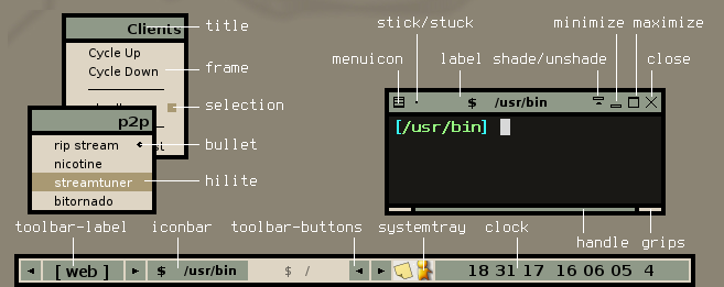
again only the new items. to get a clue of what the components of the window are look at my screenshot and check out the picture at the top of the texture-examples page.
window.title.height: <int> sets the titlebar's height.
window.justify sets the alignment of the text that appears in the titlebar.
window.label.focus.* is for the focused window, window.label.unfocus.* is for all other windows. pretty obvious i think.
the window.title.* is only used if window.bevelWidth is >0. look at the picture on the texture-examples page. if the bevel is 0, the title settings are not visible.
window.handleWidth is a confusing expression. it doesn't set the width of the handle, it sets the height of the handle/grip.
fluxbox offers some sort of eye-candy if you want to call it like that. you can make the corners of the toolbar/window/menu round. (this for sure works for classic styles as well as for pixmap stlyes)
menu.roundCorners: TopRight TopLeft BottomRight BottomLeft
window.roundCorners: TopRight TopLeft BottomRight BottomLeft
toolbar.shaped: true|false
you can set all corners round or just one or two or three and you can combine them as you like. (e.g. only 'TopLeft BottomRight')
another thing to know is that e.g. borderless applications with window.roundCorners set, stay round, if you've ever asked yourself how to get this round borderless terms.
the toolbar can only have round corners on the upper side, so toolbar.shaped (true OR false) is all you have to set.
7.
generalizing (wildcards)
maybe you have recognized that all components have the same elements such as "border", "borderColor". that will lead to an interesting part of fluxbox styling.
let's say you want to have the same font for all components. as discribed in fonts you will have to define the fonts for every single part.
but there's a quicker way fluxbox can handle that. instead of writing:
menu.title.font: sans-7
menu.frame.font: sans-7
window.font: sans-7
toolbar.clock.font: sans-7
toolbar.workspace.font: sans-7
toolbar.iconbar.focused.font: sans-7
toolbar.iconbar.unfocused.font: sans-7
the same wildcard can be used if e.g. you want the entire toolbar to have the same font. simply wite:
toolbar.*.unfocused.font: sans-7
just try it out, this way makes it even easier to style fluxbox.
btw, due to the asterisk (*) works as a wildcard for the dot (.) you could also write *font: sans-8, but don't try to use this in the middle of an expression. better use the way above to avoid mistakes.
8.
pixmap styles
as for classic styles toolbar.systray colorizing, texturizing and the use of images does not have any influence on the background of gnome-app backgrounds. icons from applications such as gaim or xchat (all based on gtk2) get their background from the actual gnome/gtk theme. only icons of kde-apps (qt) such as klipper or k3b manage to use the toolbar.systray background.
doing pixmap styles (or any other supported image format) is quite the same as writing a classic style. the only signifficant global change is that the classic texturizing is replaced with an image. to add an important thing:
whenever a valid image is set in the style, the "classic" colors/textures will be overwritten for the respective part of the style. just look at the examples below to understand what i mean. this is the clock from the toolbar:
toolbar.clock: <texture>
toolbar.clock.borderWidth: <int>
toolbar.clock.borderColor: <color>
toolbar.clock.justify: <left|center|right>
toolbar.clock.textColor: <color>
toolbar.clock.color: <color>
toolbar.clock.colorTo: <color>
replacing the texture relevant parts and replace them with pixmaps means:
toolbar.clock.pixmap: <image file>
toolbar.clock.borderWidth: <int>
toolbar.clock.borderColor: <color>
toolbar.clock.justify: <left|center|right>
toolbar.clock.textColor: <color>
as you can see the things that have changed are:
toolbar.clock: <texture>, toolbar.clock.color: <color> and toolbar.clock.colorTo: <color> are gone.
the line toolbar.clock.pixmap: <image file> was added. the three exchanged lines from above can be erased or you can leave them in the style, it doesn't matter they have no use in this case. actually it is logical, because the components's background is no longer rendered. so there's no need for texture options or gradient colors at all.
images for menu.title.pixmap, toolbar.pixmap, toolbar.clock.pixmap, toolbar.workspace.pixmap, toolbar.iconbar.empty.pixmap, toolbar.iconbar.focused.pixmap, toolbar.iconbar.unfocused.pixmap, window.title.focus.pixmap, window.label.focus.pixmap, window.handle.focus.pixmap, window.handle.unfocus.pixmap, window.grip.focus.pixmap and window.grip.unfocus.pixmap appear as high as defined by the corresponding *.height value. those images will be stretched horizontally to the length of the part.
the image size for a button should be a 1:1 ratio with the the height/width = *.height since the image is stretched horizontally and vertically if you define *.height bigger than the button-image is. this sounds confusing the way i explain it, but if you try it should get clear. you may play around with different image sizes but believe me, it's just a pain in the ass usually.
furthermore another important thing is: in a classic style all buttons are defined through window.button.*. in a pixmap style you CAN make a image for each button and their states (focused, unfocused, pressed). you don't have to but you can. to give an example of the buttons you can style look at this:
window.shade.pixmap: shadefcs.xpm
window.shade.unfocus.pixmap: shadeufcs.xpm
window.shade.pressed.pixmap: shadepr.xpm
window.unshade.pixmap: unshadefcs.xpm
window.unshade.unfocus.pixmap: unshadeufcs.xpm
window.unshade.pressed.pixmap: unshadepr.xpm
window.menuicon.pixmap: menuiconfcs.xpm
window.menuicon.unfocus.pixmap: menuiconufcs.xpm
window.menuicon.pressed.pixmap: menuiconpr.xpm
window.close.pixmap: closefcs.xpm
window.close.unfocus.pixmap: closeufcs.xpm
window.close.pressed.pixmap: closepr.xpm
window.iconify.pixmap: minfcs.xpm
window.iconify.unfocus.pixmap: minufcs.xpm
window.iconify.pressed.pixmap: minpr.xpm
window.maximize.pixmap: maxfcs.xpm
window.maximize.unfocus.pixmap: maxufcs.xpm
window.maximize.pressed.pixmap: maxpr.xpm
window.stick.pixmap: stickufcs.xpm
window.stick.unfocus.pixmap: stickufcs.xpm
window.stick.pressed.pixmap: stickpr.xpm
window.stuck.pixmap: stuckfcs.xpm
window.stuck.unfocus.pixmap: stuckufcs.xpm
window.stuck.pressed.pixmap: stuckufcs.xpm
the syntax differs a little bit from the other parts, but again it's really simple to understand. look at the little screenshot to get a clue what the buttons are.
window.*.pixmap are the pixmaps you see on a focused window.
window.*.unfocus.pixmap are the pixmaps you see on an unfocused window.
window.*.pressed.pixmap are the images you see when you click the button.
window.stuck.* is the activated state of the stick buttton.
some other things are different from classic styles. the bullet and the selection indicator (the little thing to show what configuration options are enabled or what style is selected) can be images. furthermore those elements can have different states:
menu.submenu.pixmap: <image file>
menu.hilite.submenu.pixmap: <image file>
menu.selected.pixmap: <image file>
menu.hilite.selected.pixmap: <image file>
menu.unselected.pixmap: <image file>
menu.hilite.unselected.pixmap: <image file>
menu.selected.pixmap and menu.unselected.pixmap are selfexplanary i think (they are the selection indicators). the menu.submenu.pixmap entry simply is the well known bullet.
a size of 16x16 for the bullets and selection images seem to be most appropriate. it depents on the fontsize and the menu's bevel how much they will be streched.
the *.hilite.* calls the images that show up when the mouse comes over the line of the menu. you don't have to set them. if nothing is defined, fluxbox will use the images that are shown when not highlighted.
last update 03/08/2006